Friday, September 9, 2011

re: self evaluation questions (gs674)

original post.

 Sophia said:
great variety of line and shape. I don't know how big these pieces are but they would be such an impact if they wee 5 ft by 7 ft. Happy painting.

I replied:
Thanks for the reminder, I added the sizes. Not quite that big, but I don't have the space to work any larger right now. (Plus I'd have to pay someone to help me move them around if they were any bigger, or rig something like Chuck close has. I covet his painting moving machine!!!)  They make a pretty loud statement though. They definitely fill your periphery if you stand in front of them. That's what matters. I don't think making them a little less than twice the size would change the impact enough to make it worth the hassle. I'd rather do them 7x15 feet but I don't think that would fit through my door. All in good time...


 Kathryn said:
believe it, Rutenberg teaches at the Y here in NYC.  I got into his class once (it always fills quik), excellent teacher of all approaches and ya luv his stuff too.

my response:
Jealous!!!!!!! I was going to try to get him as DS, but as I worked through my first few DS, I got further away from him. I will definitely try to track him down next time I'm in Manhattan. (Hoping to get up there for the DeKooning retrospective at MoMA.)


 Maren said: 
WOW, Emily... I think you are going to be a big influence on me.  I want to run screaming from the room.  I grew up in the 60's, got my MFA in '72 at the height of the abstract expressionist influences in art schools.  We were pushed to do anything abstract.  I was NEVER comfortable with it and still am not, but I did try my hand at the ideas bouncing around me.  I am a big fan of Pollock, Rauchenburg, Rothko, Alice Neel...  but I just cannot understand it in the visceral way that you are describing the work.
I am terribly concrete... I see it, I paint it.  I LOVE that.  Looking at your work, I sense the depth and color and value relationships, the textures and drips and shapes thrill me, but I do not see meaning or what you call the "guts of it".  I don't understand the reason for the work.
Here's hoping I come to understand it better through your words and interaction with others who are doing abstract work.  One can always learn!
Maren

Sophia said:
I think what she means is that color play, the movement of the oil on canvas, the impact on the viewer, of line work and the energy created with color is the essence of her work. I hope nailed it Emily!


I responded:
@Sophia, This work is void of oil at this point. Even the printing is water-based. There's a certain "no going back" once the oil comes out. And these all felt finished before I needed to whip out those guns. I had all but abandoned oil until Sarah encouraged the veggie oil clean up instead of turp in mixed media/printmaking. Wet oil on this scale seems like a nightmare and I prefer painting to be dreamy. We'll see what happens this semester as it all culminates. I'm not saying I refuse to add it (oil sticks, etching inks, etc) but I just have to get all the acrylic done  on all 15 paintings first. Once I whip out the oil everything slows down. I can no longer stack the paintings daily (my walls are stacked 25 paintings deep in some places), no more attaching anything, and it's really hard for me to work as slow as oil forces me to. Like I said, I'm not afraid of ruining paintings, but I also trust my guts. And my guts say, "No oil yet."

@Maren
You remind me of a lot of my students. I taught community college continuing ed for several years. The ones with art backgrounds all came to me to loosen up, to have fun and play, and to not be so critical of themselves. It worked, and they kept coming back. Even after I moved away a bunch of them got a studio together and called themselves "The Emily School", which obviously warmed my heart! I still meet with them whenever I go back.

So, the question I must pose to you, isn't thrilling you a noble enough feat?? I thrilled myself making it, and I thrilled you looking at it. As far as I'm concerned, my work here is done... (dusts off hands). You can try to make your work heavy, but try as you might, mine remains light.
You can feel however you want looking at it, but it will still be what it is to me, which is ridiculously fun and curious. I don't want you to think I'm never stuck or frustrated, I don't always know what to do next, but by the time I call it done, I'm pretty self-satisfied.

And to clarify, I said this work is MY guts. The materials are the paintings guts. The reason I do this is I'll die otherwise.

Susan said: 
Emily love your work! I feel the energy in it. I'm transitioning from realism toward abstraction now that I'm in my Directed Studies. It's challenging.

Cheryl's comments:
I read through your self-evaluation twice - it is fascinating and complex, and suits your work.
Much food for thought:
I can relate to this: I really have no clue the way things are connected inside my mind. I have restricted access.
and this: I do want to marry Liquitex green gold (PY129) - but for me it is Gamblin Transparent Indian Yellow...

This is important for all artists to know, so I am re-posting and commenting:
How do you accept new ideas and criticism?
Bring it. I absolutely love criticism of my art, the harsher the better. It makes me eager to defend, break through, and move forward. I have no problem taking or leaving feedback depending on how relevant I think it is. I have very low tolerance for people who can’t hack even the softest of my criticism. I think they are in the wrong field. I’m still honing my tact… As I'm sure you've already picked up that I’m very direct, don’t sugar coat, and sometimes come off a little abrasive. In an online class this is even harder because my delivery in person usually comes with a lot of giggling, open body language, charm, and back and forth discourse that is easier for people to take, which is lost in the anonymity of the web. I haven’t had a single semester here where someone didn’t get bent out of shape due to my feedback. However I’ve taught a ton of continuing ed painting classes and never offended anyone…
comments: The art world thrives on criticism and part of becoming a professional artist is learning how to use criticism to become a stronger artist. Every exhibition and every time your work goes public, you will encounter both positive and negative criticism - in the newspaper, online, and by the audience. It is part of the job of being an artist to listen to the critics who matter to you and use what you need to make the work better.

What are your goals? How do you intend to accomplish them?
UUUUGGGGGh..
Oh, you are going to hate the next assignment, but take it with a grain of salt, and do the best you can...

Do you work realistically or abstractly? Why?
I work abstractly because realism bores me, both to look at and to work on. The closer it is to life the more respect I have for someone else’s patience and the less interest I have in looking at it.
When people don't get my abstract work, I always ask them if they listen to classical music or jazz - which of course is pure abstraction!


Thursday, September 8, 2011

the beginning of the end of the beginning (fa620)

I think I've digressed to admit that I should focus on adding to the 10 I have. I said I would in my midpoint proposal. I'm going to start 5 this week and see how the space is. If I can fit more I'll do more and then pick the top 15 for final review. I applied for a review date. That will obviously factor in.

Bao, if you don't mind, I'm not going to propose specific goals for the class. I need the space to feel out a few different things here in the beginning. I'll give you more clear notion of what I'm after as the work starts coming in.


Background:
Here are the ones that are currently in the running.
first 5 are 36"x48", the next 4 are 40"x48" (biggest that fits in my car), and the last is 46"x48".


I have blank boards in the following  sizes (borrowed a truck):
2 - 48”x48”
3 - 40"x48"
3 - 48”x56”


Goals for the week:
1. Start 5 biggies in the manor of last semester: do and then assess and then do again.


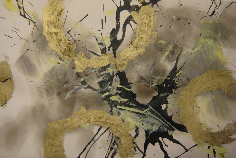
2. I'm also working on a "new" little series. I started them last week. The first layer is drawn with water and candle carbon. This is a technique I developed under the direction of Richard Elliott in my first DS. The second layer is ink blown around, a technique I got out of a book making class with Annie Cicale.  You may remember my early pursuits, Bao, as I was playing with it in Composition for Abstract what feels like a million years ago. The next layer will be an oil based monoprint (light yellow) and then gold oil stick. I'm basing these off of this piece that I turned in for said DS.

6"x9" candle carbon, ink, oil monoprint, oil stick on paper
This will be the background of one side of my business card, and so I'm working on a "match" for the other side.

Pile o' text

These new ones are 8.5"x11" I shot them before the printing because they are kind of lovely already. Some have candle wax and burning as well as the carbon and ink.


Bao's comments:
Hi, Emily:
Thank you showed the art works, you can base on there to start work the other one in big size. For the small works, I think that is also good direction, because those have sensitive feeling...
Baoping Chen

Wednesday, September 7, 2011

Self-Evaluation Questions (GS 674)

Self-Evaluation Questions
What are the 10 most important elements of your work and why?
I could break it down to four things, 1. the present moment, 2. materials 3. relationships within continuums*, and (specifically in regard to the work I’m doing for my final project) 4. moving my body.

1. I have always been most fascinated by art as artifact, a record of a moment. The mindset of the artist, the world in which one lives, the materials at hand, the exposure one has had to date and recently are all crucial to the product. No art could have been made any other time than when it was actually made. Any attempt, and its impact would be different on both artist and audience.

2. I just love paint. I love the unending array of colors and textures. I do different things to different kinds of paint and I love watching what happens. I was born with this. My mom has her MFA in ceramics, so art has always been available and encouraged, so my love for color and paint goes back as far as I can remember. In fact my mom tells a story of precocious little me. She walked in to my 2-year-old bedroom with toys all astray and hands on hips she said, “We need to do something about this room.” And I replied, “Yeah, green really isn’t my color.” I also remember a color lesson in kindergarten when the teacher said “Red, orange, yellow, green, blue, and purple,” and I interrupted, “You forgot indigo.” I’ve always been a handful.

3. At first I thought of these as the top “ten”, but ultimately I decided this list is only one thing. I like to push to the edges and find subtlety within the nuances of the following scales: color (dark/light, cool/warm, dull/bright, transparent/opaque), physical and visual texture (thin/thick, smooth/relief, small shapes or marks/big shapes or marks), approach (makes sense/slightly confusing, control/chance, additive/subtractive).  When I work I make sure both ends of each one of these things is represented. The relationships between these elements create tension and cohesion.

4. The scale of the paintings I’m currently working on is so large (at least 32”x48”) that I have to move my body a lot to cover the surface. I use my whole body to move the different paintings around. This whole body movement helps me feel healthy. It literally keeps things flowing, blood and sweat and well as creativity.

Where does your work fit into the contemporary art world?
My work fits in wherever the materials are what the work is about. My paintings are big and bold and I am clearly a child of abstract expressionism, but I also have a lot of differences. (More on this to come.)

If you could have a conversation and studio visit with any artist, living or dead, who would it be, and why?
Brian Rutenberg. He is the only living painter who seriously BLOWS MY MIND. His work is so delicious and intimate (even though they are huge). I have cried every time I’ve seen them in person because they are just so lovely. (Granted, I cry a lot.) The content is very different than that which I’m working on, but the visual impact is unmistakably similar because he includes all of the relationships I seek to achieve formally in my own work. His work is much more tied to a moment in the past. There is a nostalgia that I am not interested in capturing in my own work. But he just seems like down to earth dude and I’d love to meet up with him (and at some point probably will).

What are your ideas and ideologies? How do they fit into your artwork?
Um, ideologies? I only eat vegan food. I’m into monogamy and not into cheaters. I believe gender is a spectrum not a binary. I think Americans are generally naïve and our government is inherently evil. Bicycling is better than driving. I think recycling is a farce but I do it anyway just in case. The other 2 Rs are way more important. I wish people were more upfront and honest and direct and didn't have such a hard time with me being so. I want to dispel the myth that you only need 4 tubes of paint to make any color. I don’t think any of these ideologies are apparent in my work save maybe the latter two indirectly, but, I digress I really have no clue the way things are connected inside my mind. I have restricted access.

What are your artistic strengths? Weaknesses?
I am strong because I am fearless. I don’t hesitate. I don’t believe you can ruin a painting. I think back to the scene in the Ed Harris Pollock when Clem said the painting misses and Jack brings the painting into the living room to change it upon Clem’s whim and Jack can’t. Jack was a wimp.

My weakness used to be that I was searching for a way to put everything I love into one thing, to create one cohesive voice. But I think I beat that last semester when I realized that’s a challenge that really isn’t worth aspiring to, because I actually don’t want to do one thing. That sounds horribly boring. I like doing lots of things. I can focus on one thing and make it what it is/wants to be and then move over to another thing and make it what it is. That back and forth pendulum swing is both who I am (Libra, for sure) and what keeps me interested. I know I sound like a pompous ass, but right now I'm really not seeing any artistic weaknesses. I’m hungry, inspired, motivated, aggressive and focused. My bank account is pretty weak. I’d be doing a lot more if I had more space, but that’s really the only thing that is limiting me right now.  (This is always ebbing and flowing. Talk to me in three weeks, you’ll probably get a very different answer.)

How do you accept new ideas and criticism?
Bring it. I absolutely love criticism of my art, the harsher the better. It makes me eager to defend, break through, and move forward. I have no problem taking or leaving feedback depending on how relevant I think it is. I have very low tolerance for people who can’t hack even the softest of my criticism. I think they are in the wrong field. I’m still honing my tact… As I'm sure you've already picked up that I’m very direct, don’t sugar coat, and sometimes come off a little abrasive. In an online class this is even harder because my delivery in person usually comes with a lot of giggling, open body language, charm, and back and forth discourse that is easier for people to take, which is lost in the anonymity of the web. I haven’t had a single semester here where someone didn’t get bent out of shape due to my feedback. However I’ve taught a ton of continuing ed painting classes and never offended anyone…

What is your level of concentration while you are working on your art?
I’m usually quite in the zone while I work. An onlooker might assume that I’m scattered and all over the place, but I work on a lot of things at once. I don’t like to get too sucked in to any one piece because at the scale I’m currently working, there’s just no point in fussing about. My moves are bold and I rarely know how it’s going to turn out and that is precisely what I love about it.

What are your goals? How do you intend to accomplish them?
UUUUGGGGGh. My junior year of high school, when this question was first posed to me, I started rebelling against it hard. Though I got suspended for my over-the-top and highly inappropriate sarcasm, I consider that I won that battle because I didn’t actually ever state any real goals. I really hate goals. The word just tweaks my “I’m out of here” response. They just don’t work for me. I don’t like preconceived expectations. I don’t like closing the door to the unknown options. I thrive on the unknown option. I want to teach undergrad and keep working. I am good at wanting things, I don't think wanting stuff makes it a Goal. I don’t have a clue where, what kind of institution, what kind of position, what the future of my work entails. I could never have predicted this work 4 years ago… I have some really good human resources to help me with the job hunt. I know it’s grueling, and I’m ready (or will be once I get that tiny piece of paper that says I’m allowed to teach college level).  But beyond that, I’m tapped in the goal department. Every major progression in my life has just randomly popped up, so I’m sticking with that approach.


CONCEPT
Where do you get ideas and inspiration for your work?
I literally take reference from everything I encounter. I’m inspired by good art, bad art, conversation, nature, the city, the interwebs, fashion magazines (vogue and W), runway (I watch all the runway footage from Paris Couture in January and New York, London, and Paris fashion weeks in February and September), strangers, friends, TV (I watch a gross amount, I think teen pop TV, i.e. Gossip Girl, Pretty Little Liars, etc affects this work the most because it's in the current moment), feelings, the lack of something. Once I’ve started a painting I’m inspired by what annoys me.

What do you think about when you are making your art? How are these ideas communicated through the work?
My internal monologue goes something like this:
Is this working? What does it need? This? No. This? Yes! What about now? Well now this part is annoying me. What does it need? Too dark? Add some light. Does that help? Lighter? Ok.

I do not have loftier thoughts than this WHILE I’M PAINTING. I try to keep it visual because that’s all a viewer gets. I leave the thinking and yammering on waxing intellectual until after the painting session is over. I find once the critic walks in, the process is done for.

Why did you make this particular body of work? Is there a background story?
The background story is that I’m obsessed with the things paint does. I love watching it. My paintings are essentially the byproduct of that. I always say I could burn the lot on the lawn. I probably would have already if my mother wouldn’t have cardiac arrest.

How do you categorize your work (political or social statement, natural abstraction, contemporary realism, etc.)?
I consider my work “abstract expressionish”. I believe the first wave of abstract expressionism ended the day Pollock started to drip paint. They sought to distil painting to paint on canvas, and that Pollock did. My work is related to them, because I seek to create a direct channel from the inside of me to the outside of me. I think most Ab-Ex artists were doing that. Art for me is for me. My paintings are a byproduct of my curiosity, fascination, and obsessions.

What images or forms do you use and what do they mean?
The images and forms I use don't mean anything to me. If anyone is going to assign meaning it’s the viewer. Sometimes I draw from life, but I just use whatever is around. It’s not contrived. The visual look of the shapes is important but they aren’t intended represent any bigger meaning.


GENRE (i.e. painting, photography, printmaking, sculpture, etc.)
Why have you chosen to work in this medium?
I love paint. I love junk. Sometimes I use both. If I print, it’s just to get different types of marks, repetition, etc.

How does your choice of genre promote your ideas?
My main idea is “I wonder what happens when I do this with/to paint”. So without paint... well it would be something different altogether.

Do you work realistically or abstractly? Why?
I work abstractly because realism bores me, both to look at and to work on. The closer it is to life the more respect I have for someone else’s patience and the less interest I have in looking at it.


FORM (i.e. epic vs. intimate -- refers to space, scale, shape, structure)
What format and scale do you use and why?
I like my paintings to take over my periphery. In this way I am also connected to Ab-Ex (I have a whole long essay I wrote about how I’m similar to and how I’m different from them.) I like working small in my sketchbooks. I’m always drawing, but I think of that as training. It’s like doing scales if you are a musician. They aren’t anything but they help. Sometimes the drawings end up kind of charming, but still, they are just exercise. I wouldn’t consider it “my work.”

What meanings are implied by your use of form and composition?
I guess a certain intellectualism is implied. Even though my paintings are of nothing, it’s very apparent that the work has been developed over time. There is a sense of build-up, time passing, weaving in and out of itself. I think an art educated person can get as much out of them as a layperson. I like this about them. I think a viewer can tell a lot about me though looking at them. I am not a timid person and my paintings prove it.


PROCESS (technique, method, construction, procedure)
How do you make your work? What techniques are involved?
Add, scrape, build, pour, look, change, rotate, fling, adhere, tear, scrunch, take it outside, let it get rained on, use anything to apply paint, use paint to apply anything, get close, get far away, ask someone, cover up, wipe away, play.

What tools do you use?
I use traditional art tools, kitchen tools, nature, my hands, etc. rags, trash, you name it. I've either used it or will now.

What kind of composition or structure do you use in your work?
"Destroy anything that is annoying" is pretty much the only consistent structure.

How do you use contrast -- color, value, surface, texture?
Obsessively. Every painting must have contrast, but also subtlety.

How do you create illumination? What is your light source?
I use relationships to create light. If something is dark next to it, it looks light. I’ve also been playing with metallics, both metallic pigments and also reflective fabrics, gold only as I don’t want it to get hokey or dated. Gold is never out.


MATERIALS (think about your visual language; materials are a tool for articulating your concept)
What materials do you use to make your work?
Paint, fabric, paper, wood, plastic, metal, found objects, parts of past projects, monoprinting, lino cuts, styro cuts, rubber stamps, literally anything that strikes me. I try to use them in ways that they don’t lead the viewer the think they have meaning. I really prefer my work to be void of meaning. If anything they just give you little tidbits so you can create your own story. Paint is the most important part, fabric and paper tie for second.

What personal connection do you have to the materials?
In this body of work I have little personal connection to the materials. I do want to marry Liquitex green gold (PY129).  We have been involved for a few years now. With only titanium white (PW6) to mix with, it can be dark, light, cool, warm, dull, or bright. It's magical like that!

How do the materials that you choose visually reinforce your concept?
The materials don’t enforce the concept, they ARE the concept.


Final note.
This work is completely gratuitous to me. I work and do things that are less glutinous and self-serving, that require more sustained focus and judgment, but this stuff is my true guts.

The first one is from Abstract and interpretation 3, spring 2010, and the rest are from last semester. In between there I worked too small for it to count for my final review as I proposed 15 at least 32"x48" paintings. I did a lot of drawing and mixed media small, as well as fashion design and fashion illustration. All helping me be a master and subconsciously affecting this.

Saturday, September 3, 2011

more or less clear vs. more or or less clear? (fa 620)

Abril said: It is my take on a particular subject at a specific time. 
Brian replied:  I think this is an important point. As Kevin said, " . . . expression is an individual take on anything. It isn't copying what you see but transforming it through ones own personal vision. It is a combination of the subject and the artists take on the subject."
Emotion, passion, psychology, mood is one way to do expression, but making art out of the artist's ideas, concepts, point of view,  observations, thoughts, etc. is another aspect of being expressive.


My response: Some people are putting a lot of stock into the ideas of intention and interpretation. But we express in everything we do. They don't call them facial expressions for nothing. And granted sometimes we use the shapes of our faces to manipulate others, but sometimes our expressions betray a truth we'd rather keep inside. Expression is kind of like an attachment on a Kitchen-aide. Everything goes through it and comes out looking as if it came through us. Every attachment is different, but the end result is pretty obvious who did what.


To which Brian responded: I agree. Sometimes, I just want to find my style and paint whatever I want to my way and leave the content and meaning at that.
So, do you think that often we are really just channeling or filtering something bigger, rather than extruding pure originality from the depths of our soul? But no matter what, we have our own voices?
And do you think that we can speak subconsciously and unconsciously with our work about things we didn't know we were feeling? And if that's the case, should we not be expected to have complete answers to our motives in our artist statements?
And do you think that some artists, faced with an audience that projects intent upon them, try very hard to say nothing at all, but say something anyway? Or perhaps the artist is shy about emotions or learned as a child to hide them, and creates work that is cerebral and conceptual rather than passionate and revealing. Will something personal come out anyway?


And I replied: First, I think pure originality is a farce. We have way too much access to everything now, so nothing is entirely new. We live in an age of pluralism and duality. We have our own voices, but nothing truly original is being said. We do have the opportunity to juxtapose preexisting ideas, concepts, methods, objects, etc. into something seemingly new, but let's be frank, lasagna is still tomatoes, wheat, and fermented milk, even if the sum appears to be something different that its raw ingredients.


I pretty much always feel like I'm channeling something bigger when I’m working. I really hate using religion words, but there is something akin to spiritual about my process of painting, and, though I make conscious choices in the moment, I never have any idea what my paintings will look like when they are finished. I never know how close I am to being done. I only know when I am done because nothing says, "Change me, I'm annoying." Sometimes I feel like I'm merely hanging on for dear life as this thing takes me for a ride.


When I begin, I never have an intended mood, idea, or concept unless prompted by an outside source, like a class or commission (this is for painting mind you, I do have other projects that use a little pre-planning, figurative paper art, fashion design, etc.) I just start and then the painting tells me what to do from then on. I usually have many paintings in progress so if one isn't talking I move to the next.
So this bigger than me thing, call it the universe, god, collective unconscious, my subconscious, it doesn't really matter to me what it is, I just know that I'm not in full control.


Artist statements, I believe, should be both written and read with a grain of salt. All that is expected from a statement is a little translation of your process and why you are driven to do so. One of the things I love so much about abstract painting is that the artist has the opportunity to keep learning about their own work by conversing with viewers. For example in my undergrad senior exhibition, I made 90 9"x9" paintings all macro views of overlapping human body parts, so they appear varyingly abstract, but they are painted directly from life. I originally conceived the idea while making out with Ben Hanson and admiring the view a whole year prior to starting the project, and totally forgot about it. So when I painted them all from live models, usually my lit nerd friends sitting on the couch, mostly clothed, reading Dostoevsky, the moments, my thoughts and feelings while I painted, were totally innocent and/or technical. But when people came to see the show they saw all kinds of sex in them, and I remembered thinking up the idea 2 years previous. Listening to people guess what parts they were proved that there was a lot going on that I hadn't been tuned into while I was working, but the idea transcended despite my lack of focusing on it. Maybe that comes from in me, maybe it comes from inside the viewer, probably it’s just a basic human function, but regardless, there's more to it than just what I was looking at/thinking of while I painted.


As far as your last question(s), I think what a person chooses to do is very personal, even if it's cerebral work, it can say a lot about the artist, but there are no absolutes. I do believe that an audience inherently strips away some level of truth, because art making is so intimate. Fine art is pure and words are convoluted. So as soon as words are applied something is lost. So if an audience is projecting intent onto an artist, they can choose to confirm, deny, or elaborate, but I've always been one to think the art should say everything without a crutch of titles, descriptions, or statements. A statement should merely enhance the viewers experience AFTER they have been impacted by the work itself. Even in a case of say, Christo, his work is MASSIVE, conceptual, calculated, takes permits and paperwork, takes a whole team to install, but it says something about Christo, his concerns and interests. It helps us see the world through his eyes. Therefore it's very personal.

Oh I think I see what you aren't seeing. (fa 620)

Kevin asked: Why do inferior brands with less pigment dry darker than normal? I can understand duller, but darker?


my answer: 

The dry, cheep color isn't relatively darker than a dry, higher quality paint, just the visual look of the color changes more drastically because as we know from our pigment-free acrylic mediums, acrylic is white when wet and clear when dry. So if a paint has a lot of pigment, that color swallows up the visual white of the acrylic (only so much mass can fit inside a tube), so therefore it's closer to the actual dry color. And when the pigment load is smaller, the white plays a stronger role in the appearance of the wet paint. So it makes it harder to gauge how a painting will actually look dry, the relationships between wet colors and dry colors, transparency, etc. Cheaper paints are across the board more transparent than good ones, which means streaky in a very bad way. (tip for life: If you are going to use bad paint, use really good brushes). This rant excludes latex paint and craft paint which both usually start with a titanium white base and then other pigment is added. The other day a friend asked me to look at his paintings and I said, "Your materials really aren't doing you justice." I couldn't get past it.  Honestly, the quality of materials makes a huge difference to me as an art viewer. I mean, I'm all for using what you've got-what you find, and reusing, and appropriating, but when people use low quality paints it just says to me either, "I don't know what the heck I'm doing," or "I don't value my work enough to invest in it."  There are lots of ways to use cheep paints with expensive paints to get the most out of both! Think about the cheap paint as filler. Use it to mix larger batches of color. Use a gloss medium in or over craft paint to give it a luxurious sheen rather than that spongey Apple Barrel hyper-matte.

Friday, September 2, 2011

bet you can't make fuchsia out of your pre-packaged starter set! (fa620)

assignment:
  • Introduce yourself to your peers and instructor. Discuss your educational background in art and career goals?
  • What is Expression? 

As I said, my last semester here, then I start the grueling process of finding a teaching position. I want to teach painting at college. I'm currently the organizer of RVA Drink 'n' Draw. I host events at local bars where we play drawing games and chat about art over drinks. I've been collecting exquisite corpse drawings all summer and have pushing 300 and I'm working on orchestrating an exhibition soon. This semester I also plan to show my own work, build my resume, etc. 

I think expression happens anytime you take what is inside of you and make it available outside of you. There really aren't any other necessary and sufficient criteria. We can hone it's effect, but it's as simple as that.

Now, here comes the part where some of you groan and some of you thank your lucky stars that I'm in this class.

I started the reading (again, as I've already taken this course) and as per usual the list of "colors" tweaks my "oh no they didn't" nerve. This list on m1s5 is archaic and incomplete and therefore slightly misleading. This is not by any means the worst intro list, but it leaves quite a bit unsaid. My research is in acrylic so I’ll be referring to acrylic brands. I am aware that the following information may not apply to all oil paint and watercolor brands as those mediums are considerably more tied to tradition and generally the product lines are more extensive. Acrylic brands seems to be more convoluted and mercurial.  I will now elaborate:

First of all, color names are completely irrelevant and misleading on their own. You also need the pigment number and the brand of paint to rely on a consistent color. The pigment number has a P for pigment, and another letter or two representing the hue family, R=red, O=orange, Y=yellow, G=green, B=blue, V=violet, W=white, Br=Brown, and Bk=black Different brands assign different names to different pigments, and a lot of times those names represent colors that are "traditional" but no longer on the market. I'll get into that in a minute. This pigment number can be found on the front or back of the tube label. If your brand of paint doesn't list the pigments it's probably a low quality paint. This means there is less pigment to binder, and means that as your paint dries it will darken significantly, as the white dries clear. All acrylic paint dries darker, but the lower the quality the more dramatic the change. Also, bear in mind that many mixed pigments may look pretty out of the tube but you may already have their parents in your paintbox. So always check your pigments before you buy!!!


Now, the list:

Titanium White: bright opaque white, with high tinting strength (PW6)
The "other white" is Zinc White (PW4) it's a transparent white (Liquitex calls it transparent mixing white) There is also buff/unbleached titanium. It has the strong tinting properties of regular bleached titanium, but it's much warmer. Golden calls it titan buff. Something to note is that Liquitex "unbleached titanium" is actually a mixed pigment of bleached titanium and yellow ochre (it used to have black and red in it too, but they recently changed it) Lead white/flake white (PW1) is highly toxic. Avoid using it, zinc works just fine!

Ultramarine Blue: warm blue, transparent (PB29) This pigment was developed because the main blue people had back in the day was made from the rare and expensive mineral lapis lazuli. Today's ultramarine is a petrolium byproduct (as most of today's pigments are). It's smooth, medium tinter, medium opacity. good greens, great purples.

Cobalt Blue: transparent, good for glazing (PB28) This is a little grittier, than PB29 and never have I felt like my palette needed it. I own it, but it's not really that much more bang for your buck (very untrue in red land, where a hue just doesn't cut it) though I can't say I ever do any glazing, so I can't really comment on that. But as far as mixing goes, I find the greens to be a little cleaner with ultramarine. Cobalt is a mineral so there is an inherent dirtiness to it. There's also cobalt teal (PG50), cobalt turquoise (PB36), and cobalt green (PG26). I find them to be considerably less expendable on my palette than cobalt blue, especially the teal! I'm madly in love with it.

Yellow Ochre: dark yellow, good for toning down color PY43, there's also yellow oxide, PY42 that is a little duller and darker but behaves quite similarly. And Liquitex makes a "transparent raw sienna" that is also PY42.

Raw Sienna: warm hue, very good for glazing (PBr7) all the siennas and umbers have this same pigment number though they cover a wide variety of values and temperatures of brown. I guess this is because they are all made of dirt. It begs the question, how many do we need? Personally I have 5 different PBr7s in my collection.

Mars Black: (PBk11) This is the one I use, made from iron oxide. Carbon/lamp black (PBk7) is nice out of the tube, but a little wimpy for my taste. Be aware, ivory/bone black( PW9) really is made of charred animal bones, still to this day...

Permanent Rose: very transparent, high tinting strength OK, now, "permanent rose" is PR122, which in this day and age is usually referred to as quinacridone magenta. The quinacridone family gets tricky because Liquitex quinacridone red is PR209, Golden quinacridone red is PV19, then Golden Primary Magenta, Golden quinacridone violet, Liquitex quinacridone blue violet, Liquitex quinacridone crimson are all PV19. So you see, the name, brand and pigment are all essential to knowing what you've got.

Viridian: deep green, add white for cool green Actualy veridian green is called PG18 but this rare and i have never seen it in acrylic. This color has all but been usurped by the green monster, Phthalocyanine green (PG7) Though it may look similar, this color is a million times harder to use that actual veridian. It's soooooooo strong and therefor very difficult to get used to. Phthalocanine blue (PB15) is the same, extremely strong and hard to use, and it seems that they get more intense over time, even after a painting has dried. I try to avoid using both at all cost, save perhaps a nice rich black or a very intense green. Try indanthrene/anthraquinone (PB60) blue for a dark transparent blue that is a lot easier to deal with than phthalo, greens get a little dull with it though, amazing purples! Also try cobalt green for a nice cool green and chromium oxide green (PG17) for a little duller green.

Cadmium Red (medium): opaque, warm, bright red PR108 Come in light, medium, and dark/deep. Here is where cutting corners financially will not help you. Cadmiums are amazing for coverage as they are so opaque, I think it's wise to have all the cadmium shades, but they are expensive so use them wisely. I mix them into other more transparent reds for coverage. I don't really like the way they mix across hue lines other than with each other. They developed the pyrrole line as a synthetic alternative, the mixes are brighter, but they've got nothing on the coverage. Just like the cobalt family, cadmiums are usually a little grittier than synthetic pigments.

Cadmium Yellow (medium): opaque, warm yellow Cadmium yellow (PY35) comes in lemon/primrose, light, medium and dark.
Lemon Yellow: cool This is a cadmium pigment, unless they mean PY3 which is now considered Hansa Yellow Light.

Burnt Sienna: rich reddish brown raw sienna is yellowish, burnt sienna is reddish, raw umber is darker and cooler than the sienna but lighter and warmer than burnt umber. Raw Umber is best for making awesome blacks with ultramarine blue!

Dioxazine Violet: makes good grays with yellow, brown and greens PV23. I think if you have PV19, and a nice array of blues, you don't really NEED PV23, but it's a quick fix, dark purple, Bam, you got it! Makes lovely lavenders! It makes good browns, but you will definitely need a blue to get a grey out of it.


So I hope you have all enjoyed your pigment lesson. I just couldn't let it go. It kills me that people are so unaware of what they are buying. It kills me that neither my undergrad or graduate programs even mentioned the actual pigments. It was a community college continuing ed class where someone mentioned it and i became thoroughly obsessed. So if you have any questions, please feel free to ask! I’m happy to be your pigment guide through the semester (and next year I'll be eligible to teach 1-on-1 DS if any of you end up interested or know anyone is). I just took a grant-writing course over the summer and one of the main things I want to get funded is my pigment research and endeavors to dispel the myth that you only need 4 tubes of paint in order to mix every color. Color theory is like algebra. r+b=v but every r and every b will make a different v. 

Thursday, September 1, 2011

intro (fa620)

Assignment: Tell us all a little bit about yourself, such as your area of study at the Academy, where you're from, and any other personal information you'd like to share with the class. 


Hey party people! This is also my last semester at AAU (fingers crossed). Some of you know I moved from Asheville, NC to Richmond, VA going on 2 years ago (just a blink it feels). I'm in the abstract track. Opposite of Lori, expression is what my work is about, and I'm in here to wrangle all my wild thoughts and various endeavors. I'll be telling you lots more about that as I plan to use this class to paint my entire final project. I have 10 paintings in the running for a 12 painting projected project already, but I'm fully prepared to scrap the lot since those paintings are "so last season."

I'm so happy to have Bao for my last studio class, as his feedback is always concise and spot on.


I'm also very excited to be in class with Kevin again. Partners in crime reunited. I hope ya'll are ready for some serious art discourse! Bring it!
 

ds6: grizzad schizzool - the final chapter © 2010

Blogger Templates by Splashy Templates