7_1-7_2. I agree with you #1 and #2 it is finished both are a consistence and unity for whole over the composition.
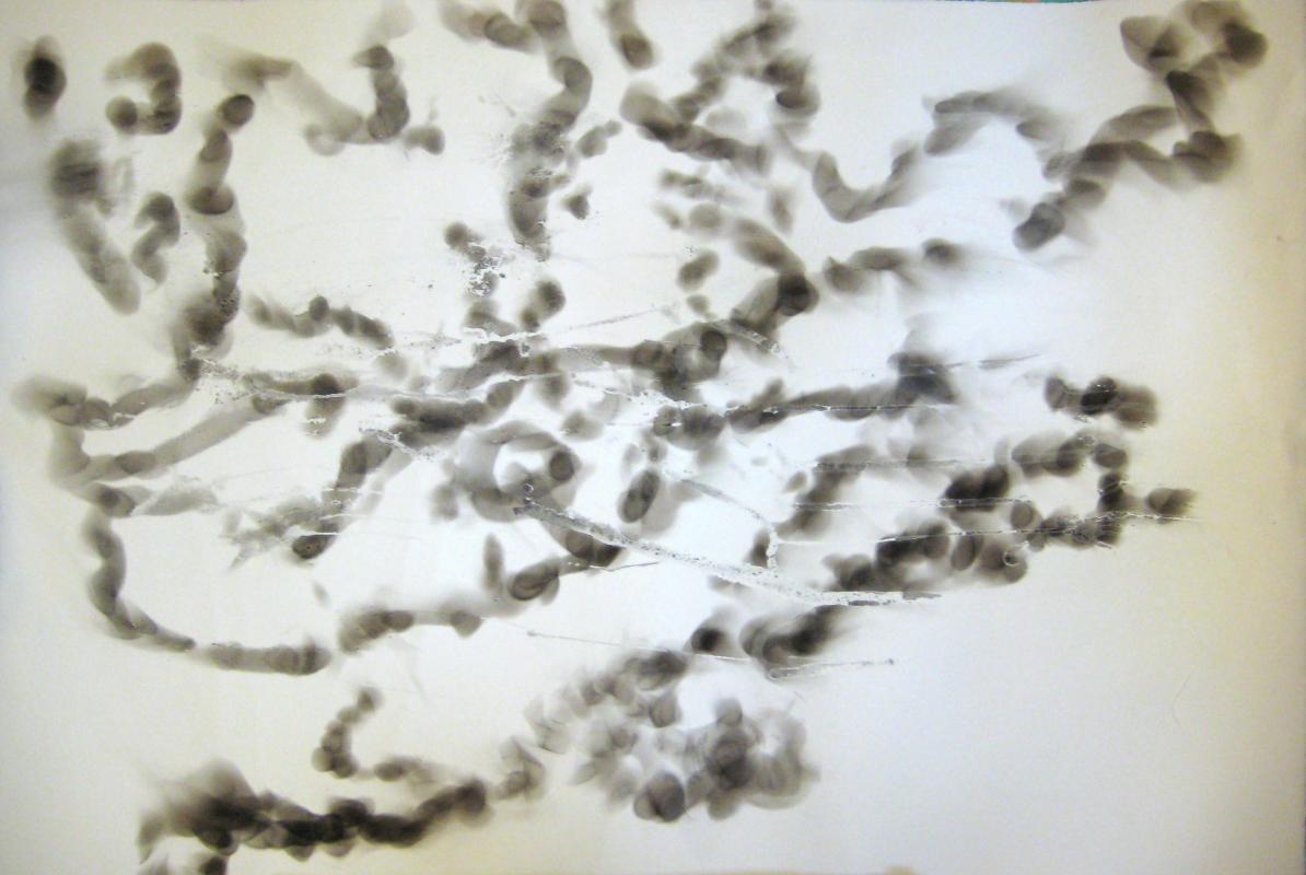
 7_3. For this painting, I think it is almost finished. But I still have a little bit suggestion that is for the letter a these areas if you have another cooler color the other layer overlap and cover little bit more the red line image. I think would be much better for create the subtlety for this red line image. Because right now from the beginning to the end for whole over the composition this red line image is really strong and pop out on the surface. If you have the other colors overlap little bit more and make this one subtle little bit some part I think create the picture the depth and make this artwork much more interesting and much more sensitive for this red image.
7_4. For this picture I think it’s finished because the whole elements is work together. Especially the color tone, value brushstrokes, this kind of elements is consistent and unity for whole over the composition create movement and depth and transparent feeling. I think this is really good.
7_5. I agree with you this artwork already finished because whole over the composition have the fresh feeling about color tone, brushstrokes, and the texture.
 7_6. For this painting I mark here like the letter a in this areas they are different shape, and form, value, color tone, and texture if you have other layers make them consistent and unity and relate to each other I think this be much better to create subtlety and depth for whole over composition.
 7_8. I really like the composition for this picture. I think it’s really powerful and dynamic. And also I really like you put the different elements of on there and make this artwork feel much more interesting and dramatic. I think have a lot of potentials to developing this artwork. So you can go ahead and continue to work for this one make the other layers.
7_9. It is a good foundation for this artwork. You can go your to own direction continue to work on.
Kevin Said :
These are looking great!
#1's dark fabric still breaks my concentration. Love this piece though!
#2 is just wonderful in feeling and it's movement. Great layers of colors/ space.
#3 is still not there for me. Maybe it is the contrast of the dark red line that stand out over the lighter background. ? Doesn't pull together like #1 + #2.
#5 I love this.
#6 is pretty wonderful! I do sorta wish I'd see the stripes repeated in a small way somewhere below. The black shaggy shapes are pretty cool. Lovin all the little stuff coming through.
#8. YEAH! I like the method of the red application. Great mix of colors and patterns so far.
I said :
You don't want it to be done? Massive overhaul it is, buddy. After turning in my midterm in 674, it's glaringly obvious that this one is the one of these things that's not like the other. There's only like 10 things going on here. And the rest have a million. So. something major is going to happen to this. I have no plans, but it's brewing.
Kira said:
Kira said:
All of these for me have impact - the movement and color palettes in particular strike as sophisticated from day one....but #8 hits it out of the park. It's less frenetic than the others. The composition is beautiful. #9 - ha! very observant!! :-)