Here's one new painting (though I haven't gotten to the paint, all found papers so far). The other is still white from gel medium so I'll edit this post, talk more about it, and post the other in the morning.
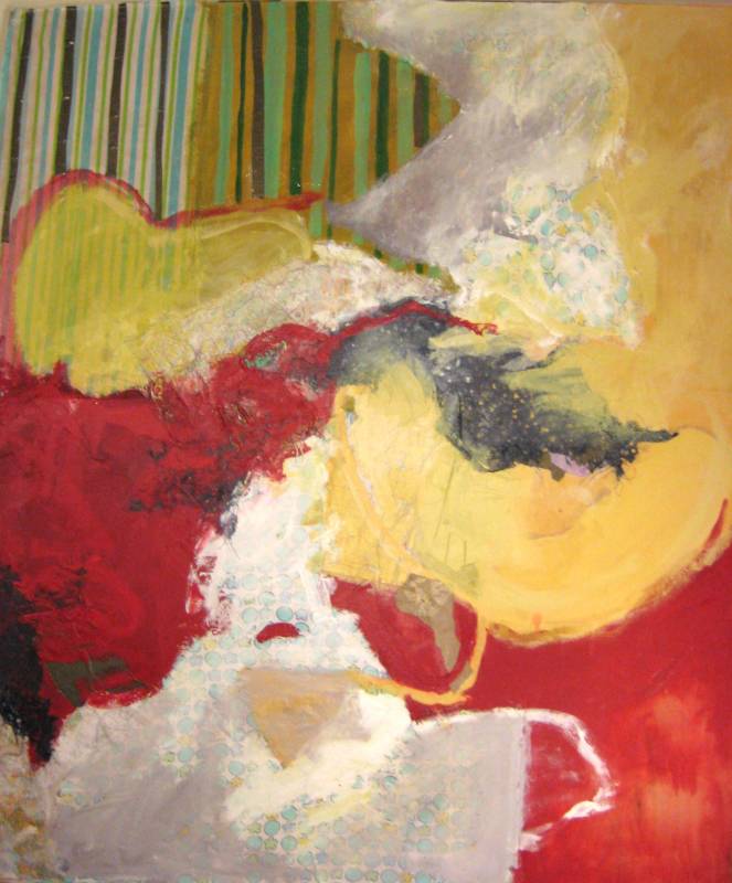
 this dark blue shape, I think the edge little bit too sharp . Of course you can go little bit further developing this artwork. So I much more prefer you make it looser little bit more for the edge. Of course this edge you suggest the negative and positive form suggestion for the image of this person here. But if you make some little bit looser little bit more I think it would be much more consistence and unity for the whole-over the composition. Because for the bottom of the composition I think this is really nice overlap and transparency and also really nice brushstrokes over each other. So therefore, the letter A, that part, if you make it little bit more consent with the other looser effect I think this would be better.
  these areas that belong to the edge of that brown color, if you make the other layers of the color overlap transparence and make it looser a little bit more for that one it would be much better. Because right now the top of the composition already have some pretty strong shape there and so bottom here if you make looser more then the top of the image will be stronger, and also keep the rhythm of the composition in the contrast. And also right now on the bottom of the right side on that shape and the line and the shape I think that is really successful it’s really sensitive to use the line and shape. It is a really good relationship between each other. So therefore that part is already good enough for these areas. So therefore if you take the letter A that part looser little bit more, and then much more appreciating on the bottom of the right side that shape. So and then if you make it looser for letter A then so the bottom also in reflection with the top of the composition. So you make the direction of the eyes up and down. So if you go that way I think this would be much better for the composition.


